Web design trends for 2022
Web design technology and trends are constantly evolving. What looked good and worked well two years ago may be starting to feel a little dated now. So, as we move towards 2022, it is important to focus on the web design trends for the coming year.
Whether you are starting a brand new business or updating your existing website, it makes sense to be aware of the latest trends and integrate as many of them as possible into your new site.
It doesn’t matter if you are in business to business (B2B) or business to consumer (B2C), your website is your brochure, your business card and your bricks and mortar store all rolled into one – and it needs to do the job of all of those things.
If you walk into a shop and it’s dark and cluttered, and you don’t know where to go for help, you will walk out again. Your visitors will do the same with your website, if they can’t easily see what they are looking for.
If your website looks unattractive and outdated, potential customers will assume your business is outdated too. But if it looks modern and is responsive, it will help turn visitors into customers.
Some aspects, like fast loading speeds and mobile optimisation, aren’t trends. They are absolutely essential for any website if you want visitors to stick around for more than a couple of seconds. However big or small your business and whatever your industry, these are the absolute non-negotiables. It is especially important since Google launched its Page Experience update in May 2021, which puts a greater emphasis on such things when it comes to ranking websites in searches.
Beyond that, the trends you adopt are based on a combination of factors, such as your own budget, your industry and your brand. Some trends will be beyond the budget of a start-up business, while others won’t work for certain industries or brands.
So the choice really is yours. You want to be sure that your website is keeping up with the latest technology and doesn’t look or feel dated, but you also want to be sure it really demonstrates your brand identity.
The key question you need to ask yourself regularly is, ‘If someone landed on my website today, would they be impressed, or would they be ready to leave in a few seconds?’
If the answer is that they would be ready to leave, that is a sure sign it is time to make some changes.
Here are some of the key trends you may want to consider for the coming year…
White space
White space is a trend which isn’t going away, because it really works. It is used by the full range of businesses from new start-ups to huge corporates.
White space allows visitors to take in everything on a page, because the space gives your content room to breathe and allows visitors to give their eyes a break. It also makes a site easier to navigate, as the next steps stand out clearly.
It helps improve readability, which is essential in getting your message across quickly and clearly. Strategically used white space can draw the eye to the key elements of your page – like a call to action (CTA) button.
Bear in mind that white space doesn’t need to be white! It can be any colour (but keep the colour consistent throughout the page). White space is all about keeping the space empty to allow the rest of the page to be seen more clearly.
Fun and optimism
It won’t work for every brand and every industry, but injecting a bit of fun and optimism into your website is a great way to get your business noticed. After a miserable couple of years, many visitors would be very happy to see a site which makes them smile.
Fun and optimistic designs can include bright colours, cheerful illustrations and graphics, unusual (but still legible) fonts and some interactive elements. This sort of design will help your business to stand out from the crowd and help visitors to stick around your site for a bit longer.
Mindful design
Mindful design is another post-pandemic trend, although in many ways it is almost the opposite to the trend for fun designs.
Mindful design means visitors aren’t overwhelmed with too much content and busy graphics on the page. There is plenty of white space, allowing visitors to take in the information they need at their own pace.
In mindful design, designers use muted colours, which are gentler on the eye for people who feel as though they spend their whole lives in front of a screen.
An added bonus of this type of design is that simpler design generally means faster loading speeds and it also generally works better on mobile devices.
3D design
It’s not so long ago that 3D design was only reserved for the biggest and richest companies, but it is becoming far more accessible now. Not only does 3D design look cool, but it is also practical in showing detail of your products, when potential customers can’t get out to see them in person.
Alongside 3D design, web designers are embracing animation, AR, VR and interactive features, all geared towards engaging and entertaining visitors and keeping them on your site for longer.
A small downside to this sort of design is that not everybody in the UK or worldwide has the best connectivity or the fastest Wi-Fi. It is important not to alienate these people with designs which are too complex and could be inaccessible to people with slow Wi-Fi.
Video
Video is another trend that was previously reserved for bigger businesses, which many companies avoided for fear of both the cost and the effect it might have on load time.
But video increases dwell time for the vast majority of visitors – according to Home Business, visitors spend 88% more time on websites with videos. So while load time will be slowed slightly, it may be a price worth paying for many organisations.
To really make the most of video, clips should be between 30 seconds and two minutes long. They should be of high quality and look good on different resolutions and different sized screens.
Original images
The quickest and cheapest way to get images for your website is by using stock photographs. But those stock photographs always look like stock photographs and have probably been used on hundreds of other websites.
To give your brand its own unique identity and help it stand out from the crowd, it is worth investing in your own original images. These could be either your own photos or your own original illustrations.
Illustrations can really tell a story and help enhance your brand identity.
If you’ve got a really good image, you could use it as a hero image for your home page. A hero image is the first thing a visitor sees when they arrive on your site and will help them to decide if they want to stick around. One of the most popular ways of creating a hero image at the moment is to combine a photo with graphical elements.
Look out for local freelance artists, who would probably be very happy to do the work for you, and may work out cheaper than you would expect.
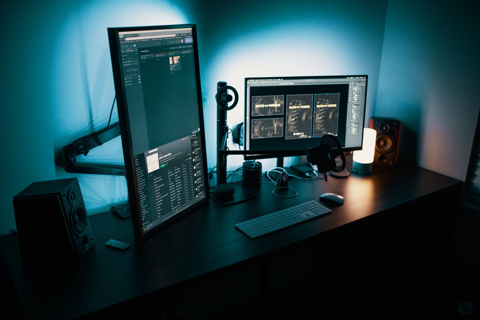
Dark mode
The dark mode trend has been around for a little while now and is still proving popular, with more designers than ever going for dark colour schemes for their websites.
Dark mode design offers a vibrant alternative to more traditional colour templates, which can help your business to stand out from the crowd. Not only does it help to highlight your images and content, it can also minimise eye strain for users.
And to make life even easier for visitors, Google Chrome is actually optimised for dark mode browsing.
Interactive content
Interactive content is a great way to increase dwell time and get visitors engaging with your brand. Few people can resist a quick quiz or poll as they are browsing the internet. Make it relevant and valuable and it will help you to find out more about your customers and potential customers – as well as giving them a little bit of fun and encouraging them to stay on your page a bit longer.
Local SEO
The pandemic brought more of us than ever into contact with the smallest local businesses, and that is a trend businesses should be continuing to embrace into 2022. Web searches with local SEO keywords and phrases like ‘near me’ or ‘close by’ have really taken off in recent years and that shows no slowing down.
If your business operates in a small local area – such as a restaurant, takeaway or beauty salon, it is important that it can be picked up in local searches eg for ‘Cheltenham’, ‘Gloucestershire’ or ‘Cotswolds’.
As we move towards 2022, it is worth taking a look again at your website design. Does it look modern and up-to-date? Does it function as you would like it to? Can visitors navigate it easily?
Web design is an ever evolving field and nothing stays still for long. In 2022, your website needs to be user friendly.
Unfortunately, if your site is starting to get dated, it will be easy for your prospective customers to head to one of your competitors and find a site which does look modern and is easier to navigate. In 2022, that isn’t a risk worth taking.
More Posts.


