Web design in a post-pandemic world
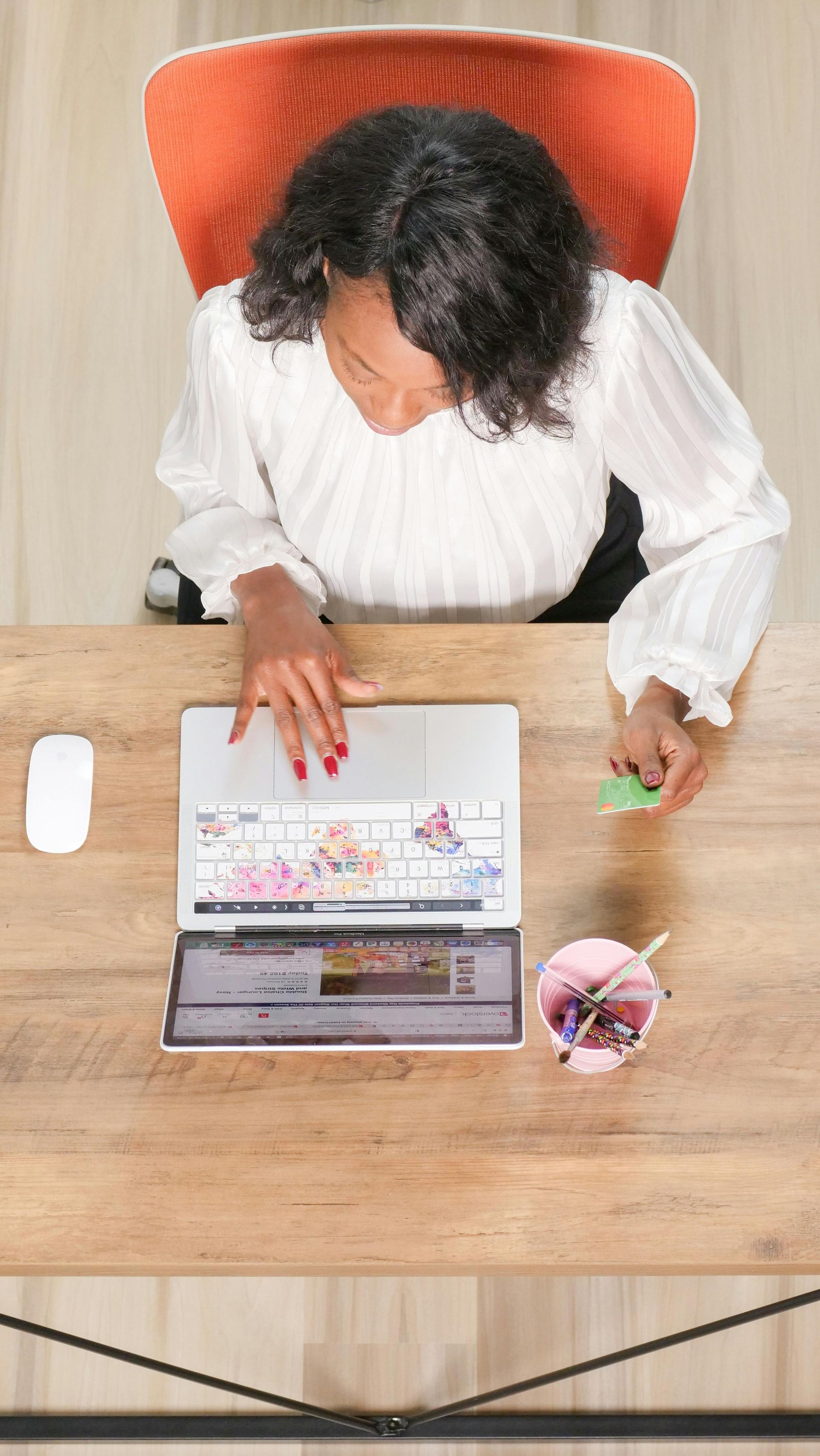
Throughout 2020 and 2021, we have lived more of our lives online than ever before.
Whether through working from home and the endless Zoom and Teams meetings or doing all but the most essential of grocery shopping online, we have all spent many hours stuck in front of a screen.
To help us all feel that bit more comfortable online, web design has seen a subtle shift – in everything from even more user friendly and intuitive ways to work to colour palettes which are more gentle on the eyes.
This isn’t a new thing - most design trends rise organically through priorities, users and the web itself changing and growing. Many new and popular web design features aren’t driven by the whims of design agencies, but by user interactions.
If you want to stay ahead of the game in 2021, attract new customers and keep hold of existing ones, it would be worth looking at your own website to see where you can make some of these changes for your business.
As good as the real thing
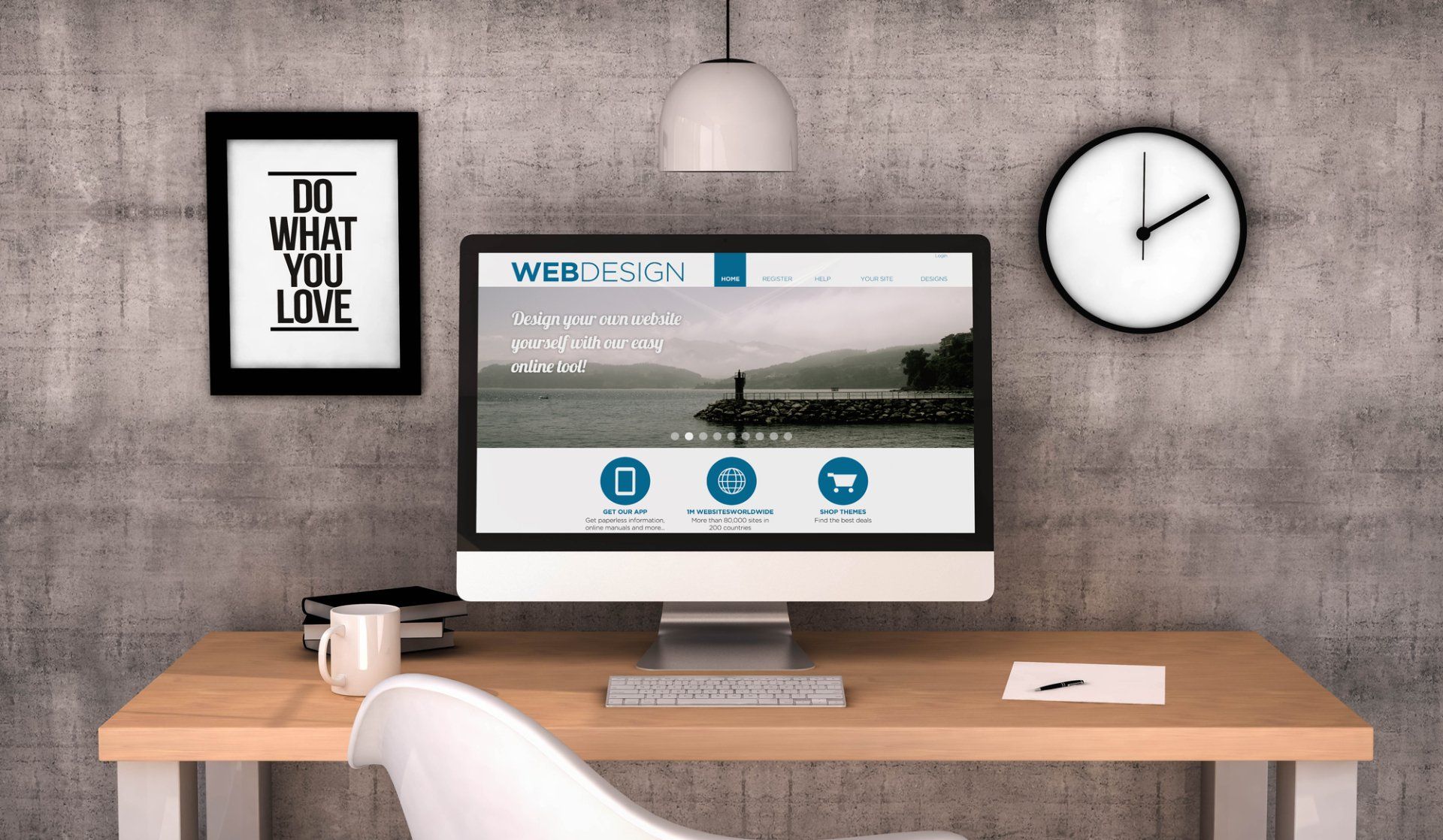
We’ve all been excluded from so much ‘real life’ over the last few months, but website design can create experiences which are almost as good as the real thing.
With most people having access to faster internet speeds, multimedia web experiences are popping up everywhere in web design. They make a richer user experience by bringing together visuals, text, video and audio, and they are no longer reserved for only the biggest companies with the biggest budgets.
Multimedia experiences in 2021 should aim to give users a real feel for your business, without overwhelming them with too much going on. For big ticket products and key pages on your website, use different media (video, audio etc) thoughtfully to maximise availability and choice of content – some people like to watch a video, some like to read text, while some just prefer to listen.
Give users chance to watch your videos in their own time, and pause or rewind as they need to, with a clear ‘play’ button, rather than just auto playing video or animations.
Augmented reality (AR) is becoming an affordable option for more and more companies, with a growing number of ecommerce sites tapping into the trend. If customers need to travel a long way to your bricks and mortar store, or you’ve noticed less people going into your shop since Covid, this is a way of allowing customers to experience your products without leaving the comfort of their homes.
And if AR is a step too far for your small business, simply providing additional photos and the ability to zoom in will go a long way towards helping customers understand your products better.
More like real life
In a time when the online world has almost had to replace the real one for many people, designers are making an effort to blend the digital world with the real world and make their websites even more like real life.
Many users don’t want to lose the physical world to the digital one entirely – which is why there has been a growth in the sales of vinyl LPs in the time of Spotify. A key design trend around this theme is layouts and fonts which are reminiscent of a newspaper or magazine. Layouts and fonts inspired by print media bring familiarity and memories of the tactile nature of reading from paper, as well as an intuitive experience for the user.
Products are at the heart of most websites and the right imagery can make them feel more organic and real than ever. Rather than flat vertical images in boxes and rectangles, experiment with different shapes and angles to bring your products to life. Can you show your products in circles or rounded rectangles rather than more harsh geometric designs?
Show your support
Web design has always been focused on delivering great user experiences. In 2021, the best user experience (UX) will come from shared values and joint causes. Throughout 2021, we will see web designers continue to value their role in helping the world through troubled times.
2020 and 2021 have been about many bad and unforeseen things, but out of that, we have seen a lot of good arising from businesses and local communities alike. This is something which is set to continue, and something you can share through your website design.
As a brand, focus your web design on the virtues of your business, such as your sustainability efforts or community involvement. Customers want to do business with brands which they see doing something for the environment, charities or their local community.
The last few months have seen a real focus on diversity too, so make sure your imagery reflects society and the diversity of your customers. Photos and illustrations on your website should show different races and cultural backgrounds, same sex relationships and families, people with disabilities and people of all ages. Customers who see themselves in your brand are far more likely to buy from your company than one which uses imagery reflecting only a very small sector of society.
Simple headers
There are few things more frustrating for a user than a website which is slow to load. Websites which load slowly are also viewed negatively by Google, which is bad for your site’s ranking and SEO.
Web design in 2021 has come up with a simple solution to this problem, which is good for users and for your Google ranking. In many cases it is your header which is causing your site to slow down, so designers are moving away from big images to large text headers instead.
This sort of simplified header will dramatically reduce your loading speed and improve your SEO. It will also bring the focus right back to your key message, rather than on an image which may look striking, but could be open to interpretation. This makes life easier for the user as they know exactly what your business is all about right from the start. And if your site loads quickly and the user quickly sees what they are looking for, that is good for your business too.
Simplified registration
Spending so much time online for users can mean an awful lot of remembering passwords and inputting email addresses. Sometimes it feels like they are needed for every website we visit and every purchase we make. But does it really need to be like that?
In 2021, try not to complicate interfaces and force users to take extra actions. Making life easier for your users by cutting down the detail can really give your website the edge.
Simplified registration and signing in is one of the latest user experience (UX) trends. For example, when a returning customer logs in to make a purchase from your site, they could just enter their phone number, rather than struggle to remember yet another password.
Easy on the eye
With everyone spending so long on their computers, it makes sense to put thought into a colour palette which is easy on the eye.
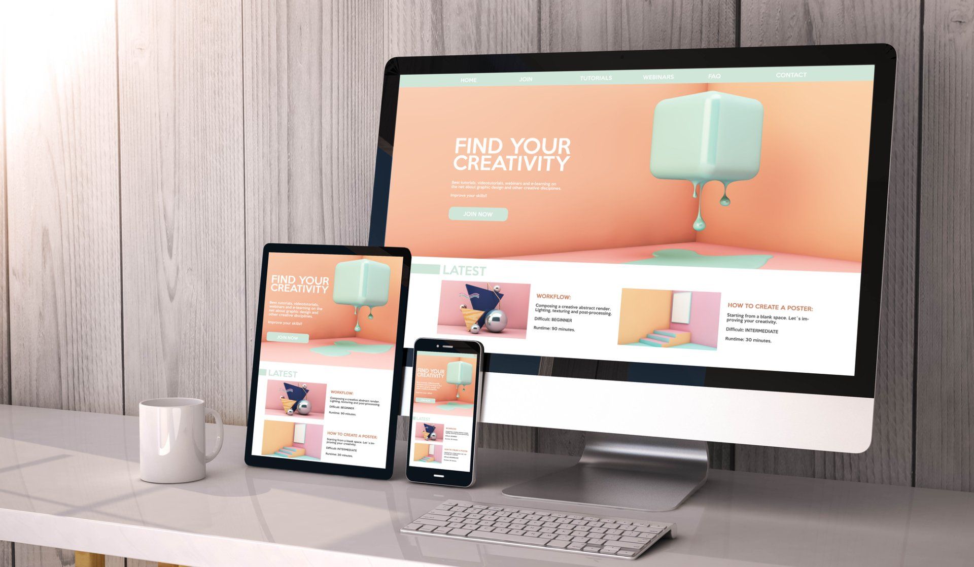
Some companies are thinking outside the extremes of dark and light and finding a middle ground in soft colour palettes, like pastel blues, warm browns, soft greens or light pinks. Designers know these colours are less jarring than stark black and white, and naturally induce calm and relaxation.
By contrast, dark mode might not immediately seem to be easy on the eye. This continuing trend looks sleek and stylish, but it also has the advantage that it can be better for users’ vision as it reduces harmful blue light, which in turn reduces headaches and eye strain.
Happy design
The health crisis of 2020 and 2021 has led to a focus on positivity and happy web designs. Companies are adopting softer, happier and even funny visuals to relieve the tensions of the last year and bring a bit of joy back into our lives.
Incorporating nature, blue skies and optimistic imagery into your design can help customers to see your brand in a really positive light.
‘No code’
Code is behind all websites, but in 2021, code is becoming much simpler, meaning far more people can get involved in web design. This is essential for small and new businesses which want to make an impact in the online world, but don’t have the budget for a complex website.
With ‘no code’ design (actually just reduced code rather than no code at all), writers can become web designers, designers can become front-end developers and small businesses can take the plunge into ecommerce.
No code removes the boundaries between non-designers, designers and developers, enabling them to work together more collaboratively to grow new and small businesses.
As we all move into (hopefully) a post-pandemic world, website design for 2021 reflects the changes society and business have been through and will keep going through in the foreseeable future.
Web design in 2021 is less like something we would see in a science fiction film and more about the experiences we would encounter in real life, away from the screen. As websites are such a huge part of everyday life, good web design is making them more real and easier to use than ever.
More Posts.


Cotswold Web Services.
