Web design ideas to suit every business
Creating a website for your business is a huge step. It is a blank canvas with which to showcase your brand to the right audience. You want to stand out and you want to appeal to potential customers. But where do you start?

Your website has literally a second or two to create the right impression. If a visitor doesn’t instantly see what they are looking for, they will leave. The most effective websites are those which are both visually appealing and easy to use.
There is a huge range of options for website designs, but many of them fall into a small number of broad categories:
- Clean and modern
- Vintage and classic
- Fun and friendly
These basic categories should give you some inspiration and help to get your ideas flowing.
Each of these categories will lend themselves to a style of font which will enhance your brand. Choosing the right category of font for your brand eg sans-serif, serif, decorative or script can make or break your design.
These typefaces all have ‘personalities’ to enhance your design. They can be serious and professional, loud and flamboyant or interesting and quiet. Some fonts are flexible and seem to adapt depending on their surroundings – particularly your colour palette and images.
Here at Cotswold Web, we’ve got lots of good ideas about what works well for different industries and sectors. Talk to us about your ideas and we will talk to you about how we can make them work…
Clean and modern design
Clean, clear modern web design has been popular for a few years now. There’s a good reason for that – it works! It is easy to navigate and easy for a visitor to take in all of the relevant information.
When you initially had a website in mind, this was probably the first design option you considered.
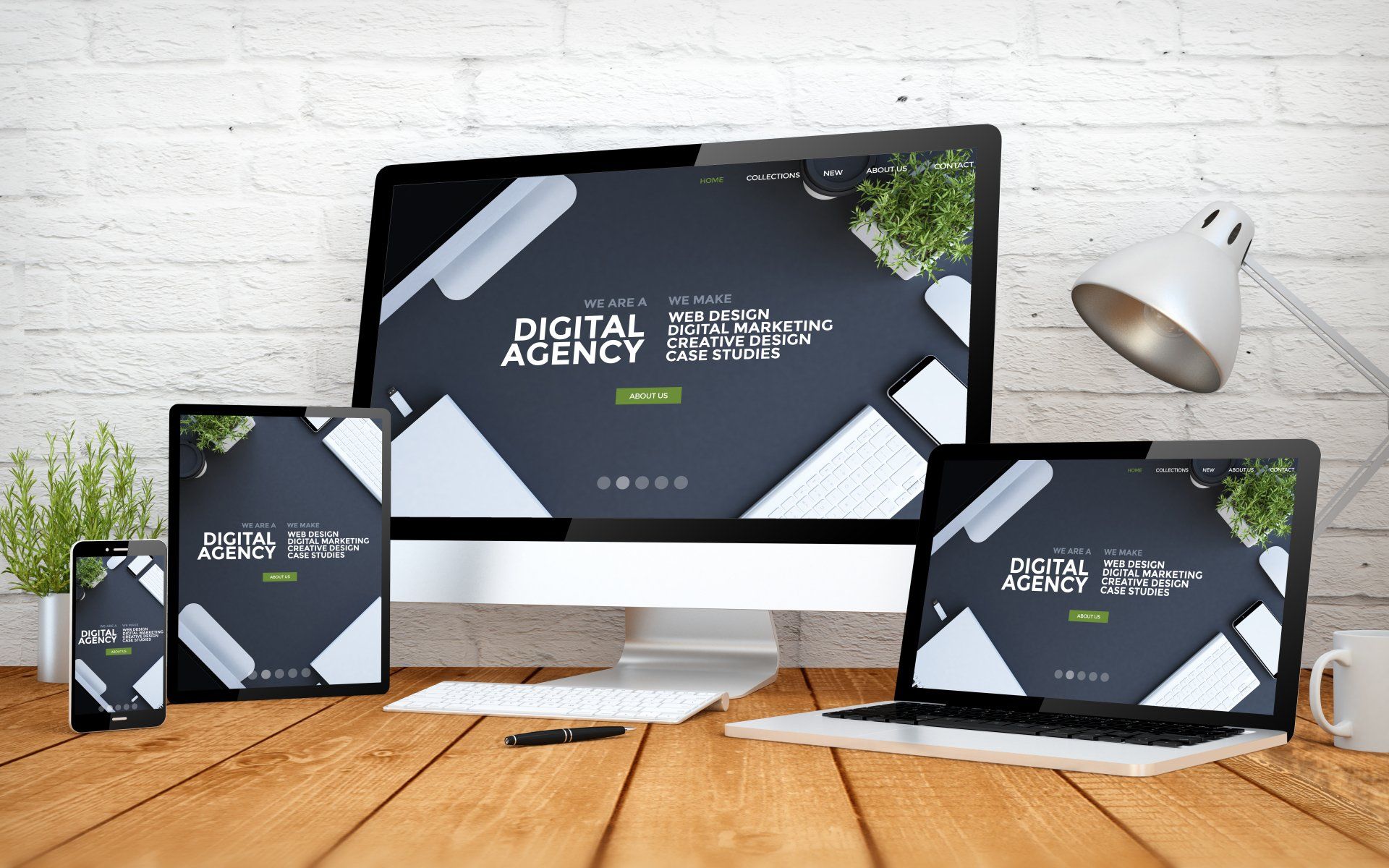
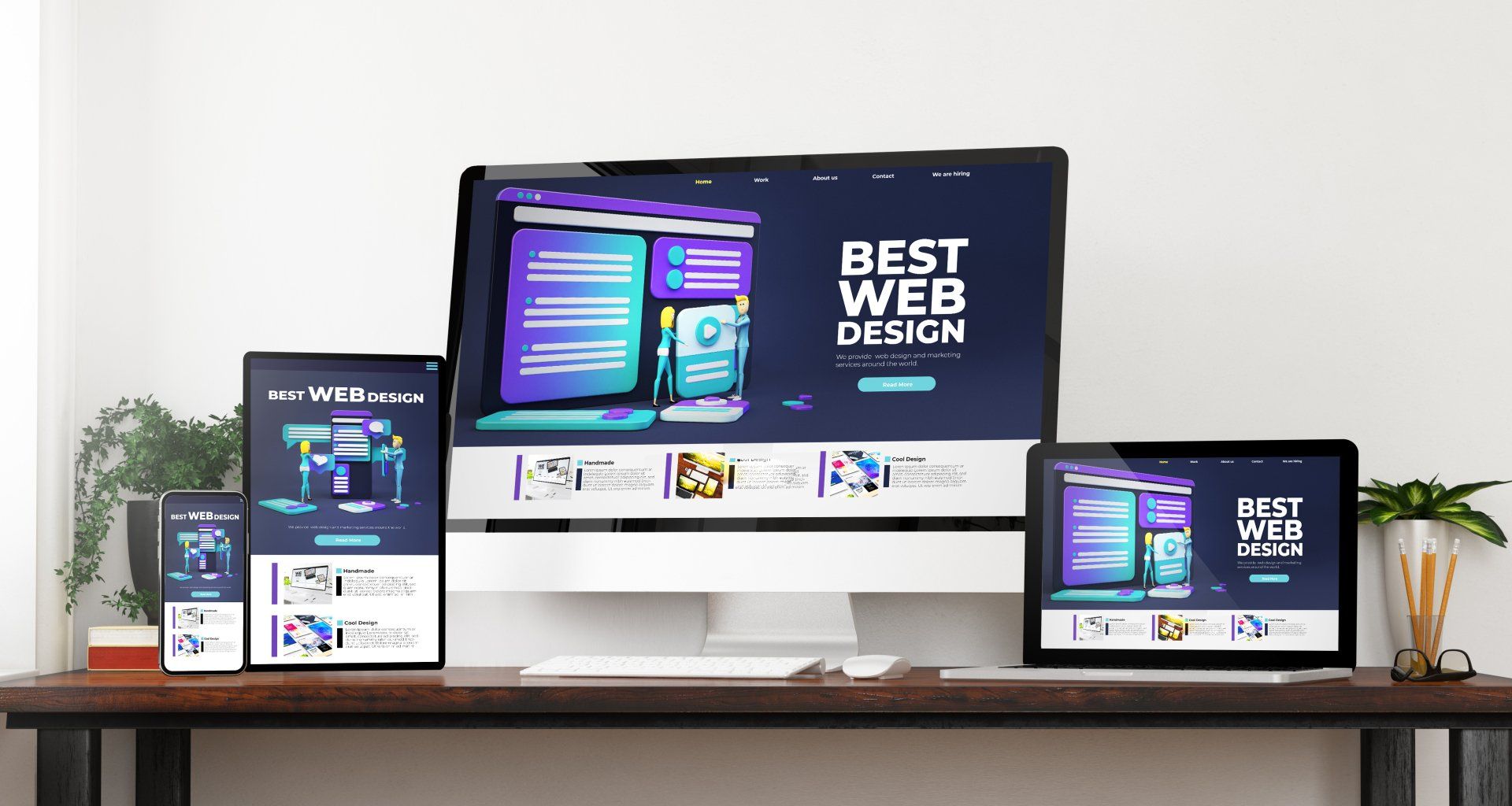
Clean and modern web design has minimalist layout, intuitive navigation, uncomplicated sans-serif fonts and a ‘flat’ feel to it.
It is more formal than some web designs, so is used in professional services fields, like accountancy, law or surveying. It is also popular for technology companies and in education.
This design will stop visitors from getting confused about what you have to offer, as it sets it out very clearly. A grid system with icons and short paragraphs makes it easy for visitors to find what they are looking for and get the answers to the questions they may have about your business.
Vintage and classic web design
With a muted palette and a font that comes straight out of your grandma’s diary, classic and vintage web designs bring the warmth and familiarity of bygone years to the 21st century.
These designs are perfect for any business which is a bit retro – such as a barber’s shop, tattoo parlour, vintage clothing brand or artisan baker.
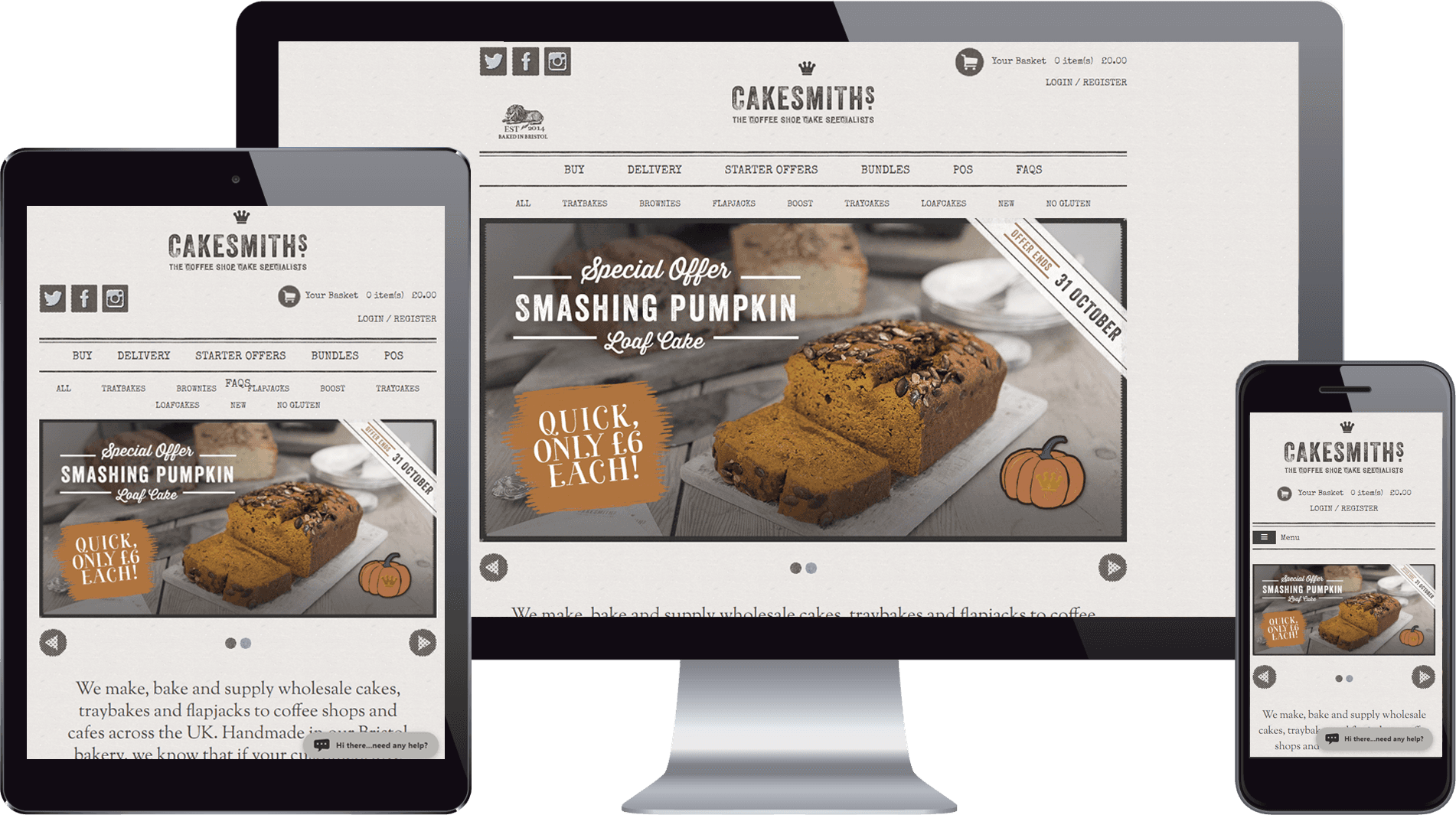
These websites achieve their vintage look with old-fashioned photos, an off-white background, aged textures and classic fonts. They show that your business likes to pay attention to detail and take care over its work – just like they did in the old days!
When so many companies are opting for clean and modern website designs, retro designs are a way to help your business stand out from the crowd.
Fun and friendly design
If you are running a restaurant or takeaway, are in the hospitality or entertainment business, are a small scale or niche food producer or are providing products or services for children, you many want to opt for more of a fun design.
You can make your website fun and friendly using bright colours, interesting fonts, infographics and cheerful and comical illustrations.
These ideas will also work for businesses in any sector which want to appear to be friendly and approachable.
Illustrations and even fonts which appear hand drawn will show your visitors that your business likes to have fun and not take itself too seriously.
Make it work
Once you’ve chosen the basic look of your site, you need to focus on the other key element of the design – making it work for a user. This is the user experience, or UX as it is more commonly known.
- Know your audience - you should have a good idea of the target audience for your website and the design should meet their needs. Although every brand is unique, you can take some cues from your competition here – if your target audience likes your competition’s website, design something with a similar layout and features. When you use a design that your audience is already comfortable with, it will help to ease them into your site. You can differentiate your business from the competition with your products and services.
- Make it easy to scan – you may think people will read your website, but the reality is that they will actually just scan it. So make it easy for them! Infographics and visuals are the quickest and easiest way to share instructions or data with your audience.
- Don’t be too creative – you want your design to look good, but don’t overdo it to the detriment of the functionality. Making users think too hard about how your site works isn’t a risk worth taking. You should aim for a familiar looking layout, where standard objects like links clearly stand out, and login access is located on the top right of the screen.
- Make it clear - decide what you want users to do, make it easy for them and definitely don’t hide action buttons. Keep your pages uncluttered and target them at the majority of users – you can make extra functionality discoverable for the minority who really need it.
- What is the focal point? – you want your visitor’s eye to be drawn to the most important elements on your page, so you need to think carefully about the layout of each page (sometimes call the visual hierarchy). There are many ways to create a visual hierarchy – including use of colour (bright colours attract more attention than muted ones), size and scale (that is the size of an element in relation to other elements of the page). Making the focal point bigger or brighter than anything else will make your visitor more likely to take the action you want them to take.
Every business wants website visitors to stick around and ultimately convert to customers. To do this, they need to feel a connection with your brand and your products. Take the time to create a website which really reflects your brand and products, and connects with your audience to improve your chances of success.
More Posts.


