How Better Web Design Helps Increase Conversion Rates

Photo by Tyler Franta on Unsplash
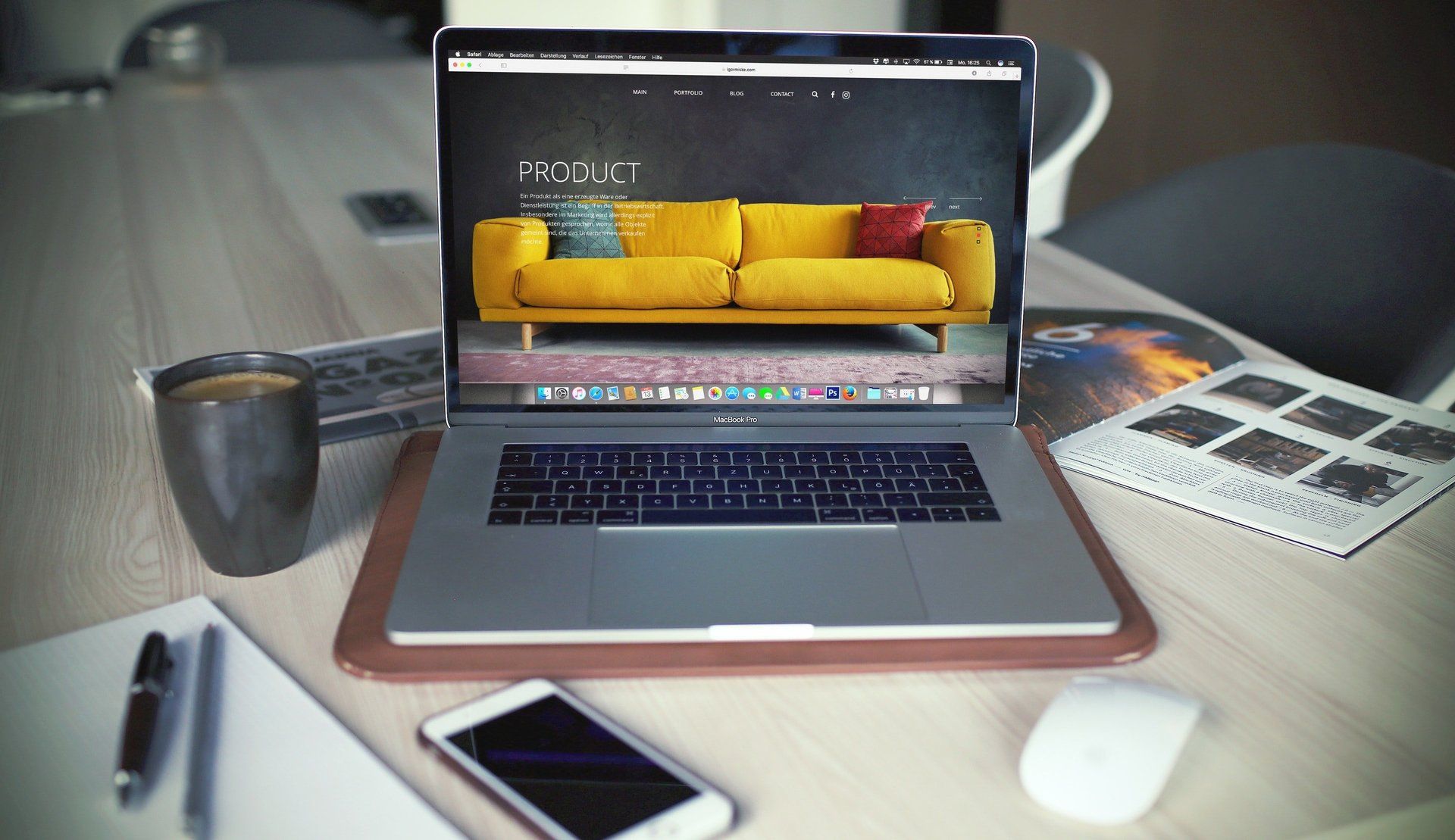
Website design plays an important role in grabbing the attention of the visitors and helps to convert those visitors into customers . Design doesn’t just refer to the visuals that we see on a website, it’s the entire structure, architecture and layout of the website which is done with the help of using contrasting colours, images, user interface and communication features.
It is impossible to display information effectively and attract consumers to your products and services if you don’t put enough emphasis on your website design. Implement the following web design principles to help you increase conversion rates.
1. Pay attention to the usability.
Creating a website that is highly usable and accessible is the difference between converting visitors into buyers or losing them at the first hurdle. To ensure that your website functions as it should, you need to determine whether it’s user-friendly and intuitive. The following factors may help you improve the accessibility and usability of your website design.
- Website speed - No matter how much time and effort goes into creating a website, viewers will quickly leave if it doesn’t grab their attention. A one second delay in a page response can result in a 7% reduction in conversions, 16% decrease in customer satisfaction and 11% fewer page views according to Kissmetrics. In a nutshell, you have to be quick off the mark these days!
- Keep it simple - One of the most important principles of web design is to ensure that it is easy for your visitors to get what they want out of your website. Too many times I have witnessed people complaining about websites, “Why is it so hard to find the information I need on this website.” If visitors have this attitude towards your website, you’ve instantly lost them as a customer.
- Make sure that the language is simple and easy to understand, but highly informative at the same time as this makes for a better overall experience. People shouldn’t be left feeling lost and confused after visiting your page.
- Content placement - The placement of your content is imperative in influencing your customer’s decision and increasing their time spent on your page. Research has shown that humans follow a visual pattern on the page.
- Users form an “F” pattern, meaning they read from the top-left side of the page and gradually move to the right. This highlights the importance of ensuring that things are offered in a particular order, so customers can move from one block of information without having to think. The hierarchy of your site should be obvious to ensure that every visitor spends a minimum amount of time reaching his/her target.
2. Keep your brand image consistent.
If your website isn’t consistent enough or it looks shabby and unprofessional, this can destroy your brand image and significantly lower your conversation rate. Attention to detail is absolutely key in making your website look aesthetically pleasing. The following tips will help you work on the aesthetic design with ease.
- Choose the right colours - Colours instantly paint a picture of your brand and play an important role in improving conversions. According to Colorcom, Consumers form an initial judgment of a product within 90 seconds of interaction and 62%-90% of them are based on the colour.
Complementary colours create balance and harmony. Using contrasting colours for the text and background will make reading easier on the eye. Colours
have also been proven to evoke different emotions in humans. So, using the right colour scheme can represent your brand and mood of your website.
Vibrant colours create emotion and should be used sparingly (i.e. for buttons and call to actions) to attract attention.
- Utilise white space/negative space - White space can really uplift the design of your website and give it a modern and uncluttered look.
White space often referred to as negative space is the area on the page that is kept vacant, which includes the space between the header, text and paragraphs and the sidebars and content. One of the best examples of white space utilisation is Apple’s website.
- Include a Call to Action button - Call to action buttons are one of the most important factors when considering conversions as they convince users to take the action we want them to.Any interaction between you and your users happens through it. If a CTA isn’t precise, there’s a possibility that conversion rates will be low.
Consider the language used on landing page buttons and ensure that it’s specific and clear. Be sure to use images, links and animations that effectively bring people to conversion.
The position and colour of the call to action button plays an important role.
Consider a colour which pops up better on the background of your website and one which hasn’t been used anywhere on the page. This will ensure it stands out well and draws the necessary attention.

3. Focus on your SEO
4. Always opt for better communication
- Be mobile friendly - Did you know that users are 5X times more likely to abandon the task they are trying to complete if the site isn’t optimised for mobile use.
- Add a live chat feature - Including live chat software on your website can give you the ability to increase your conversion rates, as it gives customers instant access to a live support agent while they’re on your site.
Have a go at implementing the above principles for improving your website design and you may just see your conversions rocket.
More Posts.