Easy tips to boost your CRO
If your website has been getting lots of traffic lately, that’s great news. But is that traffic converting to actual sales?
If your site isn’t optimised for engagement, clicks and conversions (all leading to those valuable sales), all of the traffic in the world is pointless.

Compelling CTAs
Your call-to-actions (CTAs) should encourage your visitors to take the action you want them to. Boost your chances by:
- Personalising where possible – personalised CTAs have a 200% higher success rate than standard ones
- Using action words – rather than bland words like ‘submit’, add action verbs to create immediacy and interest. Try ‘buy now’, ‘claim yours’ or ‘grab now’
- Testing – not sure which version of a CTA will work best? Use A/B (or split) testing to try out different variations
- Using CTAs everywhere – CTAs shouldn’t be just for your product pages. Every page, including your blog and landing pages, should have one. This will guide your visitors to take the next step you want them to take.
Don’t overdo the links
Links are necessary to take visitors onto the next stage of conversion – whether that is making a purchase, subscribing or something else. But if the links just take them from one page of your blog to a different page on your blog, they aren’t helping to achieve your aim.
Go through your site and ask yourself:
- What is the point of this link?
- Is it helpful to visitors?
- Will it take them to a landing page which will help boost sales or trust in your brand?
If the answer to any of these questions is no, remove the link!
Focus on the headlines
The headline is the most important part of your landing pages and your blog. While eight out of 10 people will read the headline, only two out of 10 will go on to read the rest of the page. So the headline really needs to count!
Take time to come up with different headline ideas before choosing the best ones.
There are a few useful formulas to try:
- Question. Solution: Having difficulty sleeping? Try these 10 breathing exercises
- Do something in a particular time period: Pass your driving test in two months
- Benefit. Benefit: Drive engagement. Make more sales
Buttons
When you look at a website, buttons stand out far more than links and are just asking to be clicked. So for your most important CTAs, design them to look like buttons. If you use buttons throughout your site, they should produce a 45 per cent increase in clicks.
You could increase clicks even further by using the right colour of button. But what is the right colour? That depends on your industry, your target audience and your own branding, so test a few options to see which colour is most effective.
Keep it concise!
You could paint a beautiful picture with your words. You could use all of the adjectives and adverbs under the sun, but your visitors just want you to get to the point.
So cut out the anecdotes and keep your writing focused, to avoid people leaving and heading for your competitor’s site.
Make sure your copy connects with your audience and their needs. Create messages which are intended specifically for your own target audience. The better you connect with your audience, the more likely they are to convert and to keep coming back.
Landing pages to answer every question
There is a fine line between keeping your pages concise and making them too short. You want your landing pages to give a visitor all of the information they need to answer every question they might have. The key is to keep the information essential, but make sure nothing is missing, so visitors don’t need to look elsewhere.
If you’re not sure whether longer landing pages will work for your business, test a long page against a shorter page and see which one brings the most conversions.
High quality images
Your images should enhance the look and feel of your site and your brand. Stock photos look cheesy and will no doubt have appeared on lots of other websites too. So invest some time and money in high quality images – whether you/ your team take them or you get a photographer to do the job for you.
Consider using people in your product photos, so that visitors can get an idea of how they work in daily life.
If you are selling a service, photos of the team on your website make you feel friendly and approachable and will help people to connect with your brand.
Use pop-ups (carefully!)
Pop-ups can be annoying, but used in the right way they can also help to increase conversions.
Good ways to use pop-ups effectively without irritating your visitors are:
- Add a cookie so that each pop-up only appears once for each visitor
- Add in a time delay, so visitors have time to browse before they get distracted by a pop-up
- Make it easy to close the pop-up down – on mobiles and tablets, not just laptops
- Vary the offers in your pop-ups to see which works best and to keep your visitors interested
Share reviews
More than nine out of 10 people check online reviews before buying a product. Genuine reviews are a powerful tool which provide reassurance and reduce risk to prospective customers. They also help you build trust with new visitors.
Add a selection of reviews on landing pages throughout your site. Make sure they are near the top of the page, so visitors don’t miss them.
Don’t forget to update them regularly, so it doesn’t look like you only had three good reviews back in 2016 and nothing since!
Use video
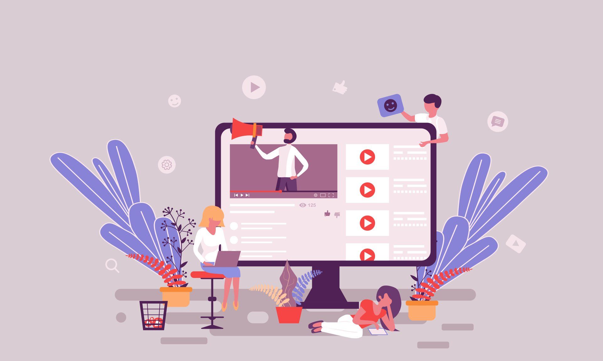
Whether it’s YouTube or TikTok, people love watching videos for both information and entertainment. So if you are unveiling a new product or demonstrating how to use an existing product, videos are a great way to keep your audience engaged – and make them more likely to buy.
Visitors will spend nearly twice as long on websites which have videos and are 64 per cent more likely to go ahead with a purchase after watching a video about a product.
Use a chat box
Live chat is becoming increasingly popular – and for good reason. Using a chat box increases conversions by 40 per cent.
Live chat is quick and personal and makes it easier for visitors to engage with your brand. In turn, that helps speed up their purchasing decisions and makes them less likely to look for an alternative product from a competitor.
Keep your pronouns friendly
When people arrive on your site, they are there because they want to know what your business can do for them.
But is your website all about you – or all about your customer? If it says ‘I’, ‘we’ or ‘our’ a lot, your site is too focused on yourself, not on what it can do for your visitors. Think about how you can turn sentences and statements around to ensure they are focused on your audience rather than yourself.
So rather than say: ‘Our product comes with a one-year guarantee’, say ‘You’ll get a one-year guarantee with your product’.
Don’t ask for too much information
When a visitor is ready to make a purchase or sign up for a subscription, don’t lose them by asking for too much information. Faced with a form with too many boxes to fill in, many visitors will choose to leave.
So ask for only the essential information – name and email address is usually enough to start with.
Don’t force customers to register either, always offer a guest checkout option, so that they can make a purchase quickly with a minimum of information.
Consistency with your ads
If you’ve got PPC Google Ads or maybe Facebook Ads running, make sure your advertising and your landing pages give a consistent message – your ad copy should promise what your site delivers.
By providing accurate and consistent information through your ads, you will cut bounce rates and increase both dwell times and conversion rates on your site.
Don’t forget SEO
CRO is all about converting visitors into customers, but how do you get the visitors in the first place? Search engine optimisation (SEO) is what brings many of your visitors to the site, before CRO works to move them onto the next step. So make sure copy across your site is relevant to your brand and products, and meets the demand from your prospective customers.
Not only does SEO bring you the visitor numbers, it also brings you the qualified leads who are interested in what you have to offer. Without the right visitors, all your CRO work will go to waste.
You can’t boost your CRO overnight, but by following these tips you should see an increase in visitors who go on to take the next steps on your website and ultimately make a difference to your bottom line.
More Posts.


