Creative web design ideas to increase your sales and conversion
Whether you are just starting out with a brand-new business or looking to update your website, the design needs to work to increase your sales and conversions.
If you don’t get the design right, potential customers will click away long before they’ve had a chance to explore your content.
On the flipside, you could have the most stunning website in the world, but if it’s not converting visitors into customers, there is no point! If your site has steady traffic, but low conversion, sadly that is generally a sign of poor design.
Web design isn't just about aesthetics; it's also about usability. A well-designed site can help customers find what they're looking for faster, while providing a better overall experience. If you want to improve your website conversions, be aware of its flaws, put your visitors ahead of your own preferences and start making changes.
Here’s our top web design ideas to increase your sales and conversions. You could do them yourself, but you could also work with a marketing agency with years of experience. Here at Cotswold Web, we offer web design services in Cheltenham, covering Gloucestershire, the Cotswolds and further afield, which could really make a difference to your sales and conversions.

Design for user experience (UX)
When designing a website, your users must come first. Which means designing for user experience (UX). Key UX considerations are whether your website is easy to use and pleasant to use.
If visitors have a good experience on your website, they are more likely to trust your brand and ultimately become customers.
Designing for UX isn’t easy for people with no web design experience, which is why we would always advise using a web design agency for your website.
Load speeds
If visitors are met with a slow site, they are going to leave before they’ve had chance to look at your products or services. Semrush advises a load speed of one to two seconds. Any longer, and your visitors start to get frustrated.
Importantly, load speeds also affect your ranking on Google. Slow load speeds mean UX isn’t as good as it should be, so search engines rank slow sites lower on a search engine results page (SERP).
White space
White space (sometimes known as negative space) is a design trend which has been around for a long time and it is here to stay.
White space (which can actually be any colour) is the empty space between your text, images and other elements of the page. Having this space on your website makes it much more readable and easier to understand.
When designing your website, make sure there is plenty of space between the header and content and between the paragraphs. This reduces distraction on the page, which in turn helps to improve conversions.
F Pattern
The F pattern is the way most of us read and digest information. We start at the top left corner, read along to the top right corner, then move down to the next line – rather like the letter F.
If your website design follows this principle, with the top left corner creating a particularly good impression, it will encourage conversions.
Rule of thirds
The rule of thirds is another way we take in and digest information. It is used to determine the best place on a page to share key information, as it is where the eye is naturally drawn to.
Imagine a page is divided into three both horizontally and vertically. The four squares in the centre of the page are the best place for important content like calls-to-action (CTAs).
Use the best images
A study by PR News found that online content with good images gets 94% more views than those without.
Good images act as storytellers. Visitors to your website will ‘read’ the images and, in a split second, make a decision whether or not the rest of your website content is relevant to them.
There are plenty of stock images out there, but most of them will have appeared on hundreds or thousands of other websites. In addition, they may not completely reflect your brand. If you can, take photos yourself or commission a photographer to do it for you. Taking care over your images shows you are serious about your brand, which helps potential customers to trust your business.
Here at Cotswold Web, we can advise on the images which will help your website to convert.
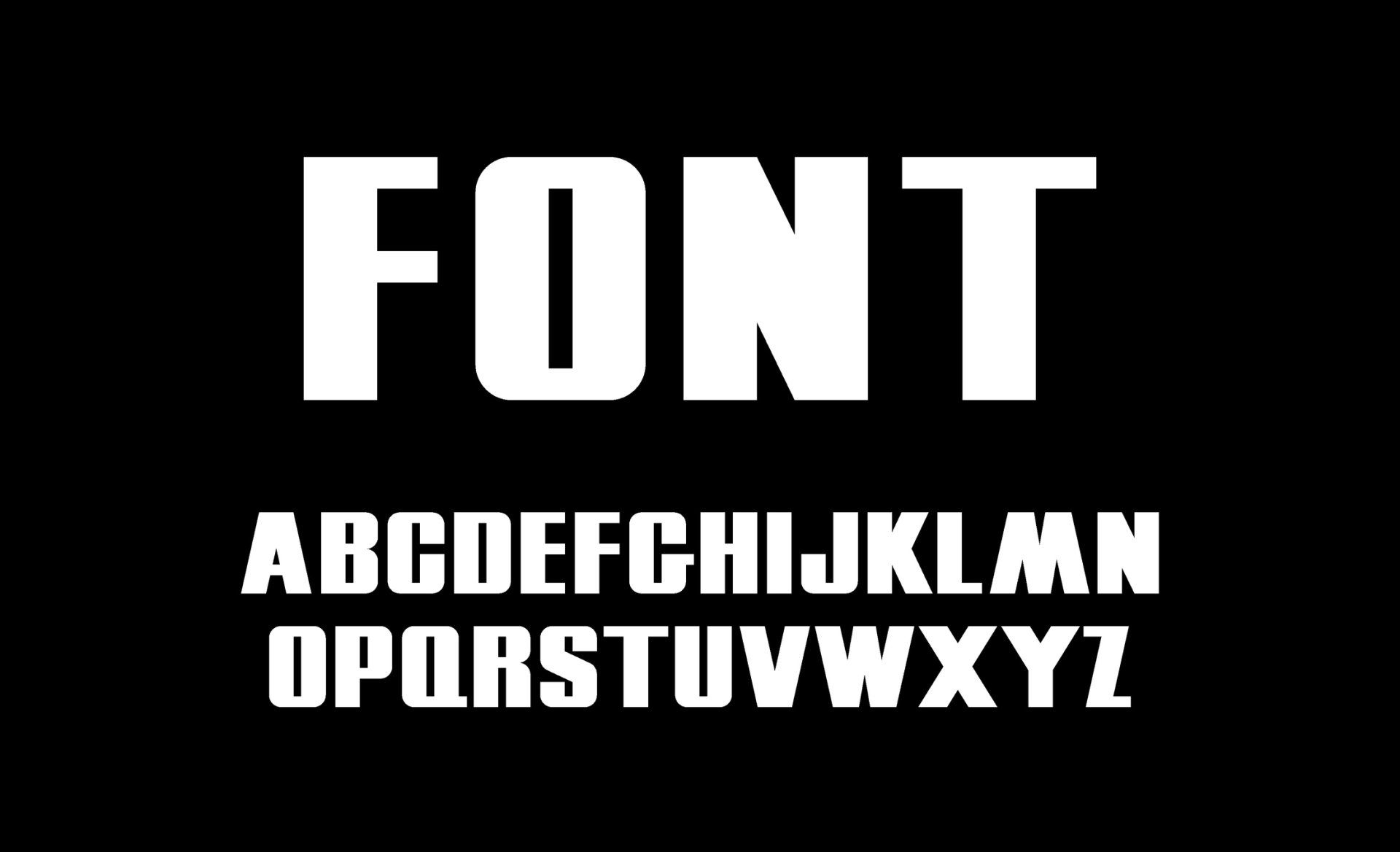
Typography/ fonts
One area where you don’t want to get too creative is your use of typography/ fonts.
People want to read a clean website that doesn’t hurt the eyes, so make sure your fonts don’t make it difficult for them!
Your font can and should match your branding. It shouldn’t be boring, but it should be easy on the eye and easy to read.
Landing pages
Your landing pages are where visitors end up when they click through from an ad or social media post. These visitors are interested in your brand and what you have to offer, so your landing pages need to maximise the chances of them converting. A landing page should really follow through on the promise in your ad or social media post. If it doesn’t deliver on what the visitor thought they would be getting, they won’t convert.
A landing page is focused on a single project or offer, with every element of the page geared towards your call-to-action (CTA). Avoid any unnecessary links, pop-ups or navigation options which could prove distracting or even encourage visitors to leave. On a landing page, there should be no chance of a visitor getting distracted and performing a different action.
For high ticket items, you could even consider separate landing pages for the same product, but for different audiences eg someone coming over to your site from LinkedIn will probably want to see something different from someone visiting from Instagram.
Effective CTAs
For a visitor to convert, your website and especially your landing pages need effective calls-to-action (CTAs).
You need to include CTAs throughout your site. A landing page should only have one CTA, to minimise distractions and increase the chance of conversion. An effective landing page may have the CTA appearing two or three times on the page, to ensure a visitor can’t miss it if they don’t scroll down far enough. There should always be sufficient white space around your CTA to make sure it stands out.
There is a lot of discussion about the right colour or the right wording for a CTA. The key for the colour is that it should stand out from the page, while not appearing completely at odds with your branding. Wording should be kept simple and direct – Buy now; Book a seat; Start a free trial.
Menus/ navigation
Your menus and navigation are another area where it’s best not to get too creative! Consumers are all pretty savvy with websites and know how to navigate them. They expect to find a menu in a particular place and to be able to navigate in a particular way. If a website does something different, that can be confusing and can be enough to make a visitor walk away.
Remember:
· Put menus in a familiar place
· Use familiar labels like ‘About’ and ‘Blog’
· Use colours for texts and backgrounds which are easy to read
· Make sure menus are small enough to fit on the page, but big enough to be legible and clickable on all devices
Social proof/ reviews
Social proof and reviews are an essential part of any website design.
They show that others have used your products or services and are happy with them. This helps the undecided visitor decide to take the plunge.
Reviews shouldn’t get in the way of your CTAs, but they should be easy to find. Many businesses have them running along the bottom of every page, so visitors don’t even have to search for them.
Mobile site
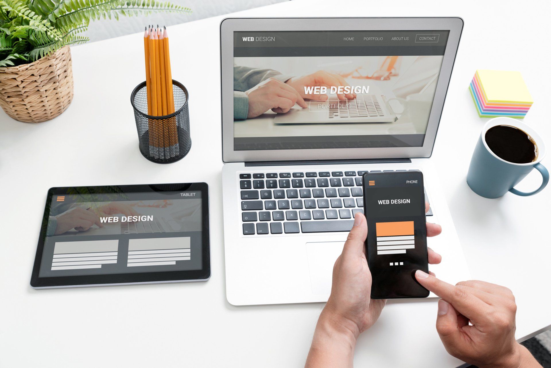
The mobile and desktop experience are different for visitors, so your mobile and desktop sites should be designed differently.
On a mobile site, less is more. There is no room for distractions, because they can completely obliterate your key message and the action you want your visitors to take.
You may use different CTAs on your mobile site. While the action or offer is the same, the button and the way to access it may be different, to allow for the much smaller screen size.
Designing for mobile is a particular skill and it would make sense to use a web design agency like Cotswold Web in Cheltenham. We have years of experience in knowing what works and what doesn’t!

Video
Video will bring your home page and landing pages to life. Used on more and more websites, it is no longer something which is expensive and reserved for only the biggest brands. In some sectors, the audience will expect to see video on a website.
A video can tell a brand story or explain how a product works far better than a few paragraphs of copy or static images.
In fact, statistics show that:
• 97% of video marketers reported that video increased user understanding of a product or service
• 76% of video marketers said video helped them increase sales
• Including a video on your landing page can increase conversions by more than 80%
• 56% of consumers believe that a company should have video content on its website
People are more likely to become emotionally attached to your brand after watching a video, which makes them more likely to convert.
Abandoned baskets
Abandoned baskets (or carts) are a big problem for ecommerce businesses. Is your design letting you down and increasing the likelihood of shoppers abandoning their baskets? If so, it is important to find out where the problems are and improve your design.
Look at:
• Are there too many steps?
• Is it too slow to load?
• Is it confusing?
Even minor inconveniences will be enough to drive people away. Redesign your shopping process to eliminate any friction and turn almost-sales into actual sales.
Unless your website converts, there really is no point having a website. Today’s consumers expect results, and they expect them fast. If your content is good, but your sales and conversions are low, you need to review your design.
Web design is about so much more than the look, it’s about the experience for consumers. Your website should look good, load quickly, navigate seamlessly and work well on mobile, so that visitors keep coming back and don’t consider doing business elsewhere. But that isn’t easy to do if you’re not a web designer yourself.
Using a web design company will make all the difference. Cotswold Web is a web design and marketing agency based in Cheltenham, with years of experience and knowledge of all the latest business software solutions. We can work with you to come up with a creative website design to increase your sales and conversions.
More Posts.


