A/B testing to improve conversions
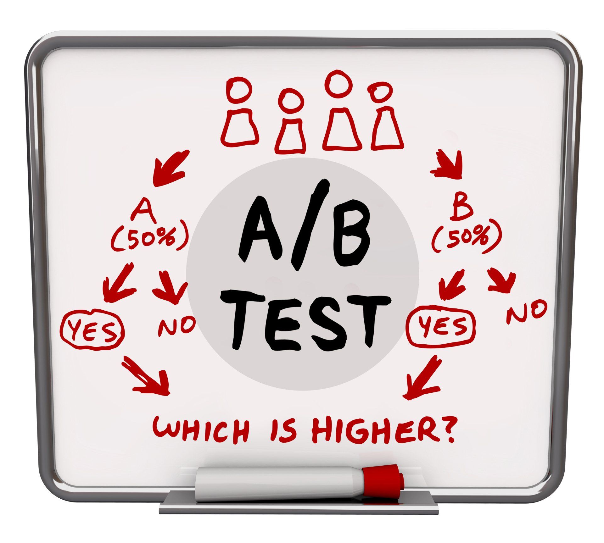
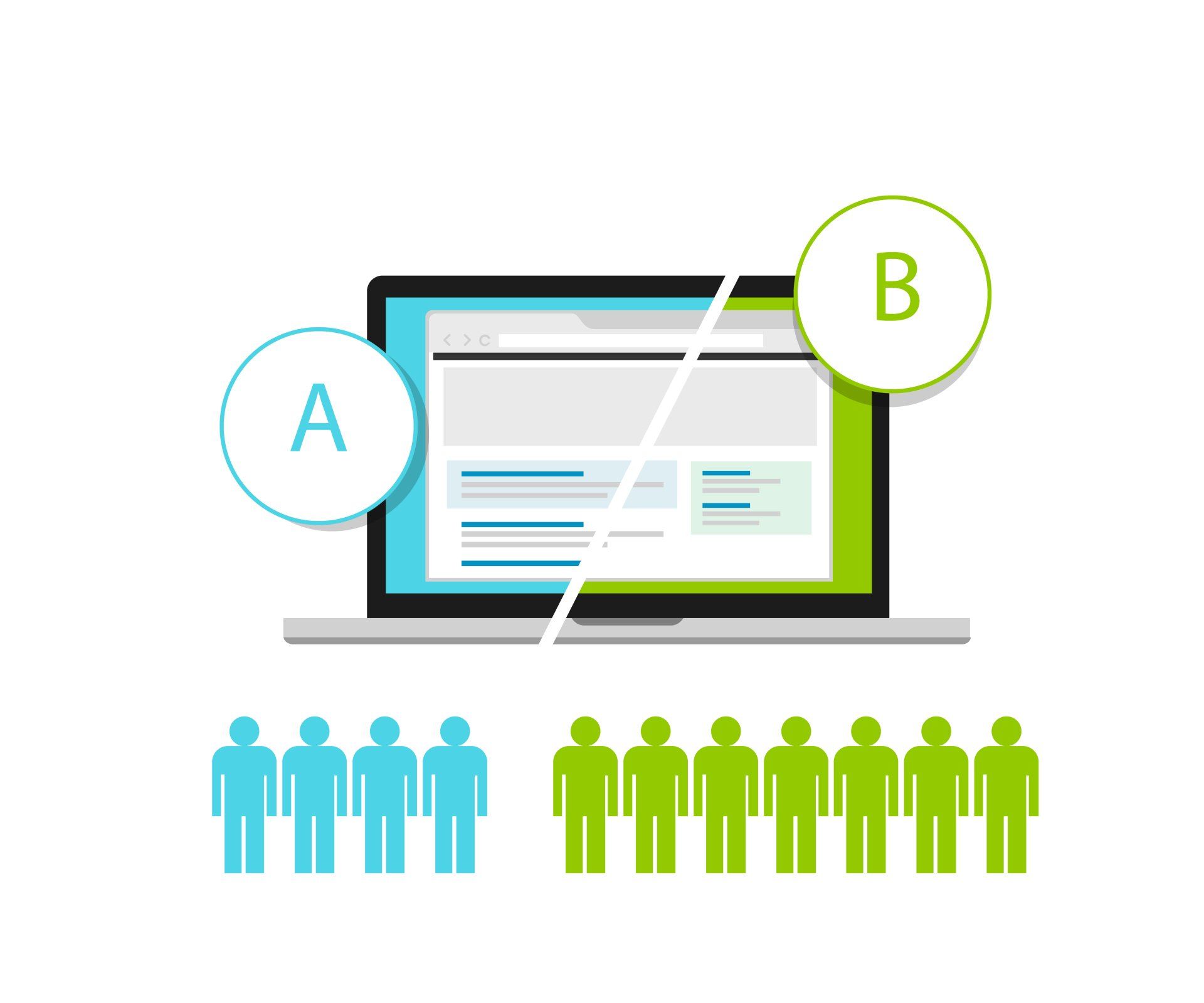
A/B testing, sometimes called split testing, is comparing two different versions of a web page, email or ad to see which performs better.
A/B tests are carried out by giving one version to one group of people and a different version to another group. You can then judge which one works best, whether you are looking to increase sales, clicks or subscriptions.

- Headlines and copywriting
Your headline is the first thing visitors see, so it needs to grab their attention. If you’re not sure what to write, digital marketing expert Neil Patel has a video with some great suggestions. The remainder of your copy is important too – think about the length of your paragraphs and the language you use. Are your potential customers interested in the hard sell or a softer approach, do they like formal language or a chatty style, do they prefer statistics or anecdotes?
- Images and video
The images you use and where you place them can increase conversions, so test different variations. Do people prefer close-up products shots or photos of people using the products? Do they react better to larger or small images? Would people rather watch a video than read a page of copy?
- CTAs
Your call to action (CTA) tells visitors what you want them to do, and even small changes can make a difference. Try using a button instead of a link or a different size, shape or colour of button. The important thing is to change only one element at a time.
- Page length
Some people want to know everything there is to know about a product from the start, while others just want the basics. Not sure which category your target audience falls into? Test shorter landing pages and blogposts against significantly longer versions to see which ones convert better.
- Email subject lines
Email can be a very effective form of marketing, but the challenge is always to get people to open them in the first place. If a reader isn’t interested in the subject heading, they will simply delete without opening. Vary the length of subject lines and try questions or action words to see which works best.
- Product descriptions
Do your customers need to know everything from your product descriptions, or are they happy with basic information? Test detailed descriptions against shorter versions to see which works best. Once you know what length of description to use, try testing the layout too – do your visitors respond better to bullet points or a simple few lines of text?
- Reviews and testimonials
At least 70% of people use online reviews before they buy, so it’s really important to share reviews and testimonials across you site. Test star ratings against words and static reviews against scrolling reviews. Do testimonials work better if they are bigger or a different font to the other text on a page?
- Landing pages
Your landing pages are some of the most important pages on your site. If visitors don’t convert here, you risk losing the sale. Test the layout of your landing pages to find out where people are more likely to click, then put the most important elements of the page, like your CTAs, in that position.
- Email marketing
It is easy to A/B test your marketing emails – simply send one version to half of your subscribers and the other version to the other half. Make sure each half is balanced and representative of your entire audience, so that the results are valid.
How to do A/B testing
A/B testing isn’t rocket science, but you need to start with a strategy. Target the areas which are working least well or which can give you the quick wins.
You could start with a question, like ‘Why aren’t subscribers opening my emails?’. By making changes to the subject line, images, copy length etc, you can collect the data which will give you the answer to the question.
Here’s an easy process to follow…
- Choose what you want to test
It should be relevant to the improvements you want to make – so if you are looking to improve conversions, focus on your headlines or a CTA.
- Set goals
What are you looking to improve? Whether it is sales or conversions or time spent on a page, focus on a single goal first to give you clear data.
- Analyse your data
Use something like Google Analytics to look at your existing data. This is your starting point and your aim is to improve on your starting point.
- Choose the page to test
Focus on an important page first, which could be your home page or a landing page with lots of traffic. Improving this page could have a significant impact on your bottom line.
- Set the elements to A/B test
Start with the elements of your page which are most likely to help you reach your goal.
- Create your challenger
Create a variant of the element you selected above, with just one change. You might change the wording of the headline or the colour of the CTA button, while everything else should stay exactly the same.
- Choose your testing tools
If you are A/B testing your email, most service providers have built-in testing tools. If you are testing your landing pages, you could try Crazy Egg’s tool.
- Design your test
Make sure you include detail like how long the test should run for, because you want enough data for it to be meaningful.
- Wait for the data
Some tools, like Crazy Egg, will allow you to keep track of the progress of your test. When the test finishes, you can see how many people visited each variation, what devices they used and more.
- Analyse the statistics
Did your original version win, or was it the challenger? Was there a significant difference between the two variations?
- Start again
Once you have your data and your winner, you can start the process again with a different variant.
How long should a test run?
How long an A/B test should run depends on the sort of traffic you usually get and what it is you are testing. Testing an email is likely to be much quicker, as most people either open them straightaway or not at all.
It is important to run the test for long enough to iron out any differences over time. It may be that one variation appears to be much more popular at the start, but the difference between them decreases after a few hours or a few days.
If you are testing a landing page and have steady traffic, testing for a few weeks will probably give you the clear, statistically significant results you are looking for.
Many companies publish the findings of their A/B testing, so that others can benefit from their learning. You could look at A/B testing examples from other websites for inspiration and guidance. While your test is unlikely to be identical, it will give you a clearer idea of what to expect.
When looking at your results, you should consider how many visitors each variation received and by what percentage the winner beat the loser. A single figure percentage difference might indicate that your audience had no real preference for one variation or the other. But if one outperforms the other by 20 per cent or more, you have got valuable information about what your audience prefers.
A/B testing doesn’t give overnight results, but the results are accurate and reliable. They are one of the best indicators of what your audience likes in terms of the content and layout of your website, emails and ads. A/B testing can also help you create a smoother journey through your website, with less chance of your prospective customers becoming frustrated and going elsewhere, all of which will boost your sales and profits.
Keep going back and following the same procedure to help you learn more about what will persuade your audience to convert. This information can then feed into your website going forward to help the growth of your business and the bottom line.
More Posts.


